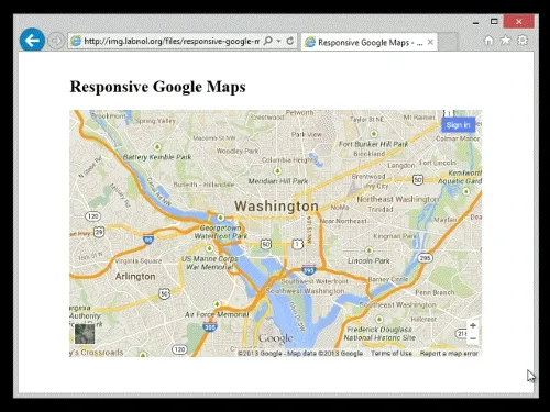
It take two easy steps to embed Google Maps in your web pages. While you are on the Google Maps website, search for the place or area that you wish to embed, click the hamburger icon in the upper left corner and choose the Share or embed map option from the menu. You may embed standard maps, satellite maps, or even street views.
Embed Google Maps Responsively
This web page contains a sample map embedded using the default embed code provided by Google Maps. The embedded map is non-responsive. What it means is if you open the page on a device other than your desktop computer, the Google Map won’t fit the screen and you’ll have to scroll the page horizontally to see the complete map.
Here’s another web page that contains the same Google Map but now the map has been embedded responsively. Thus, if you resize the browser or view the page on a mobile phone, the embedded map would adjust its size automatically based on the size of the device where that map is being viewed.
How to Embed Google Maps Responsively
This is the default embed code generated by Google Maps:
<iframe
  src="https://www.google.com/maps/embed"
  width="600"
  height="450"
  style="border:0;"
  allowfullscreen=""
  loading="lazy"
></iframe>
As specified in the height and width parameters of the embed code, the default height for the embedded map objet is 450px or 75% of the default width (600px).
If you wish to transform this static sized Google Map into one that is responsive, all you have to do is add a few CSS styles to your web page and wrap the embed IFRAME inside these rules.
The new embed code with responsive style will be something like this. You can change the value of padding-bottom (line #4) from 75% to something else for a different aspect ratio.
<style>
  .google-maps {
    position: relative;
    padding-bottom: 75%; // This is the aspect ratio
    height: 0;
    overflow: hidden;
  }
  .google-maps iframe {
    position: absolute;
    top: 0;
    left: 0;
    width: 100% !important;
    height: 100% !important;
  }
</style>

<div class="google-maps">
  <iframe
    src="https://www.google.com/maps/embed"
    width="600"
    height="450"
    style="border:0;"
    allowfullscreen=""
    loading="lazy"
  ></iframe>
</div>
Lazy Loading Google Maps
Lazy Loading is a technique that allows you to load Google Maps only when the user scrolls to the position on the page where that map is embedded. This helps improve your website performance and your site’s web vitals score as the heavy JavaScript code that loads Google Maps is not loaded until the user scrolls to the map.
Earlier, websites had to use the Intersection Observer API to gradually load maps and images as they become visible on the screen. This is no longer the case as most modern browsers now support the loading attribute on the img and <iframe> elements.
Simply add loading='lazy' to the IFRAME element and browser will defer loading of Google Maps that are off-screen until the user scrolls near them. A similar technique can be used to embed Instagram videos and photos.


