This guide explains how you can use the gatsby-image plugin with GraphQL queries to display optimized images inside your Gatsby pages and React components. The images are lazy-loaded with blurred SVG background, the large images are resized automatically and the meta data is stripped from images.
<Image src="sunset.png" alt="Sunset" />
The gatsby-image plugin generates multiple versions of an image for different display/device scenarios and these are served inside the <picture> element. Small images are embedded inline and served as base64 while SVG images are not processed by the plugin.
Here’s how the image is served inside the HTML:
<div class="gatsby-image-wrapper" style="position: relative; overflow: hidden;">
  <picture
    ><source
      srcset="
        /static/images/6d161/175833.png 150w,
        /static/images/630fb/175833.png 300w,
        /static/images/2a4de/175833.png 600w,
        /static/images/40a00/175833.png 647w
      "
      sizes="(max-width: 600px) 100vw, 600px" />
    <img
      sizes="(max-width: 600px) 100vw, 600px"
      srcset="
        /static/images/6d161/175833.png 150w,
        /static/images/630fb/175833.png 300w,
        /static/images/2a4de/175833.png 600w,
        /static/images/40a00/175833.png 647w
      "
      src="/static/images/2a4de/175833.png"
      alt="Upload files from Google Drive"
      loading="lazy"
      style="position: absolute; top: 0px; left: 0px; width: 100%; height: 100%; object-fit: cover; object-position: center center; opacity: 1; transition: opacity 500ms ease 0s;"
  /></picture>
</div>
Step 1: Create the Images Folder
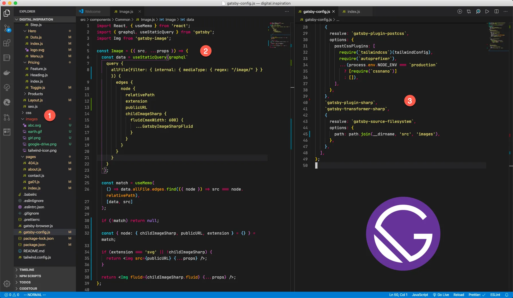
Open the src folder in your Gatsby directory and create a subfolder called images. All images that wish to serve via Gatsby images plugin should reside in this folder.
Step 3: Install the Gatsby Image plugin
npm install --save gatsby-transformer-sharp gatsby-plugin-sharp gatsby-source-filesystem gatsby-imageStep 3: Update the Gatsby Configuration
Update your gatsby-config.js file to include the image plugins and for reading the image files in your images folder.
const path = require(`path`);

module.exports = {
  plugins: [
    {
      resolve: `gatsby-source-filesystem`,
      options: {
        path: path.join(__dirname, `src`, `images`)
      }
    },
    `gatsby-plugin-sharp`,
    `gatsby-transformer-sharp`
  ]
};
Step 4: Create the Image Component
Go to the src/components folder and create an Image.js file. Here the maximum width of the generate image file is set at 600 pixels but you can modify it to suite your Gatsby site’s layout.
import React, { useMemo } from 'react';
import { graphql, useStaticQuery } from 'gatsby';
import Img from 'gatsby-image';
import PropTypes from 'prop-types';

const Image = ({ src, ...rest }) => {
  const data = useStaticQuery(graphql`
    query {
      images: allFile(filter: { internal: { mediaType: { regex: "/image/" } } }) {
        edges {
          node {
            relativePath
            extension
            publicURL
            childImageSharp {
              fluid(maxWidth: 600) {
                ...GatsbyImageSharpFluid
              }
            }
          }
        }
      }
    }
  `);

  const match = useMemo(() => data.images.edges.find(({ node }) => src === node.relativePath), [data, src]);

  if (!match) return null;

  const { node: { childImageSharp, publicURL, extension } = {} } = match;

  if (extension === 'svg' || !childImageSharp) {
    return <img src={publicURL} {...rest} />;
  }

  return <Img fluid={childImageSharp.fluid} {...rest} />;
};

Image.propTypes = {
  src: PropTypes.string.isRequired,
  alt: PropTypes.string
};

export default Image;
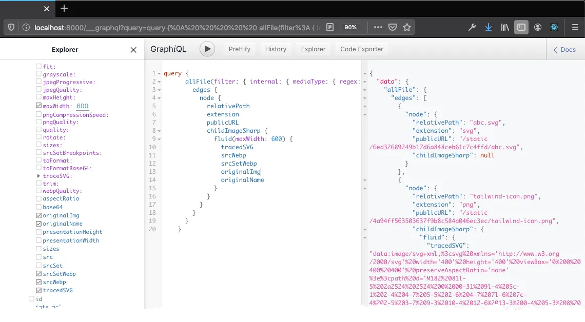
The GraphQL query filters all files that have mimeType of images and then compares the relativePath of the image with the fileName passed in the src props.
If the file is found, it looks at the extension of the file. SVG images are served without optimization while all other image formats are served compressed and optimized.
Step 5. Embed Images in Gatsby
Now copy the image that you wish to use in your React component / Gatsby page in the images/ folder. Let’s say the name of the file is sunset.png. Include the image in your component using the new Image tag.
import Image from 'src/components/Image';

const Sunset = () => {
  return (
    <>
      <p>Sunset Image</p>
      <Image
        src="sunset.png"
        className="mx-auto shadow-xl"
        alt="Sunset Image"
        style={{
          border: '10px solid green'
        }}
      />
    </>
  );
};

export default Sunset;
You can include custom CSS styles, classes, alt tag and all other attributes that are available with the HTML <img> tag.


