A good number of websites - including the one you’re currently reading - are now using Responsive Web Design instead of building separate designs for mobile and desktop screens. The same design is served to all devices – including desktops, tablets, mobile phone, e-readers and even gaming consoles - and the layout magically adapts itself based on the screen’s resolution.
Also read: Responsive Web Design - A Dummies Guide

How to Test Responsive Design Websites
The best part about responsive websites is that you test the design in your desktop browser itself without requiring any mobile emulators. For example, the iPhone is 480x320 pixels in landscape mode and if you resize your web browser to that exact size, you’ll get a good idea of how your website looks like on the actual device.
Then there are tools available that will help you test your responsive design across all popular screen resolutions (or devices) from one place.
- mattkersley.com/responsive – You can use this tool to quickly test your site layout against standard screen widths (or breakpoints). The source code is available on Github and you can thus expand it as per your requirements.
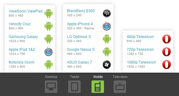
- quirktools.com/screenfly – This is my favorite tool for two reasons – it supports a much larger number of screen resolutions (including TVs) and second, Screenfly sends proper user agent strings while requesting web pages for different devices. Thus you get the best of both worlds (see notes).
- responsinator.com – Another nicely-done tool to help you understand how your responsive site will look on the most popular devices in various orientations. It can replicate the iPhone, iPad, Kindle and Android smartphones.

PS
websites – like google.com or facebook.com – use the Same Origin policy for the X-Frame-Options header and thus, in simple English, they cannot be embedded inside an IFRAME. However, you can still use Screenfly to test their designs as this tool sends the fetch request behind a proxy server and doesn’t just render pages inside simple IFRAMEs.See more ways to test your mobile websites.


