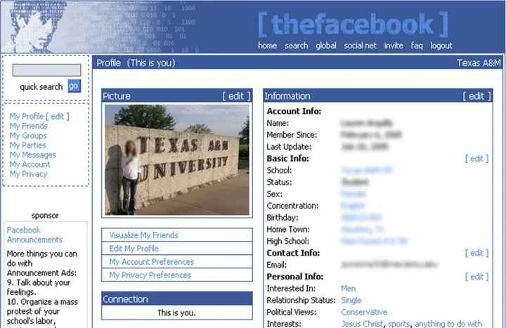
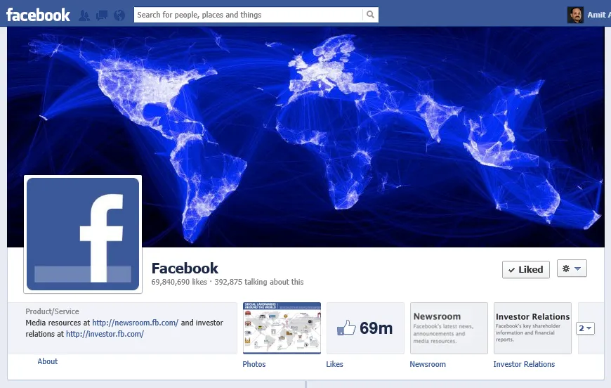
The original design of Facebook, when it was called thefacebook.com and you were required to have an .edu email address to even open an account on Facebook, was blue in color. The new Facebook which has close to a billion members is also mostly blue.
 The design of original Facebook - thefacebook.com - was blue
 The new Facebook website design is also blue
Why is Facebook Blue in Color
Facebook has gone through some major redesigns in the past few years but one part that has more or less stayed the same in all those years is the site’s blue color.
Everything is so blue about Facebook right from the sign-up page to the logo, their mobile app and even the site pop-ups that have shades of blue. Why?
A New Yorker story on Mark Zuckerberg explains why Facebook is all blue in color. It says the young Facebook founder is color blind but can see blue:
Colors don’t matter much to Zuckerberg; a few years ago, he took an online test and realized that he was red-green color-blind. Blue is Facebook’s dominant color, because, as he said, “blue is the richest color for me - I can see all of blue.”
Related: How a Color Blind person sees your site?
Emil Kostov sends this note on why Facebook maybe sticking with blue:
It is part of their well planned Marketing plan. Most colors distract and make the human eye focus on them while blue act as a transparent palette for 65% of time spending watching the main background aka index space. It is well known also that blue color is the nirvana for the brain, as well green. Well, their choice make the competition envy most of the time.


